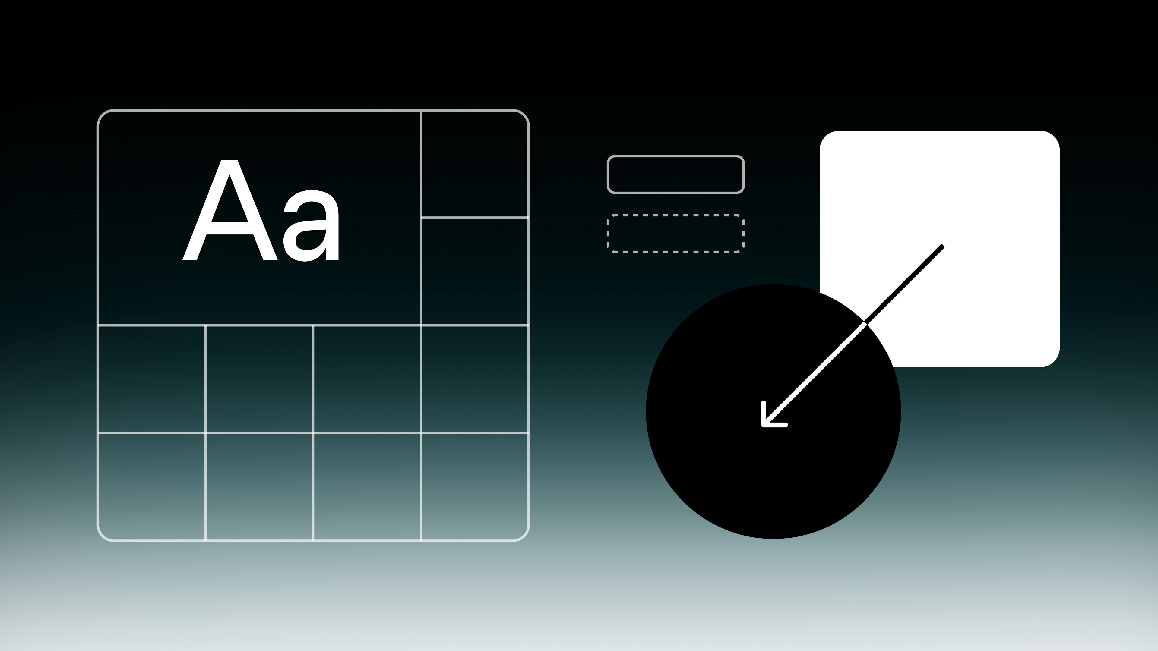
This design update introduces Dark Mode, improved color contrast, better Dark accents, adaptive typography, and more cohesive forms, enhancing app aesthetics and usability.
This is part of a series of updates to make Glide apps more user-friendly and visually appealing. There has been a lot of careful design consideration put into this update, from the contrast of our color system to how typography adapts across breakpoints.
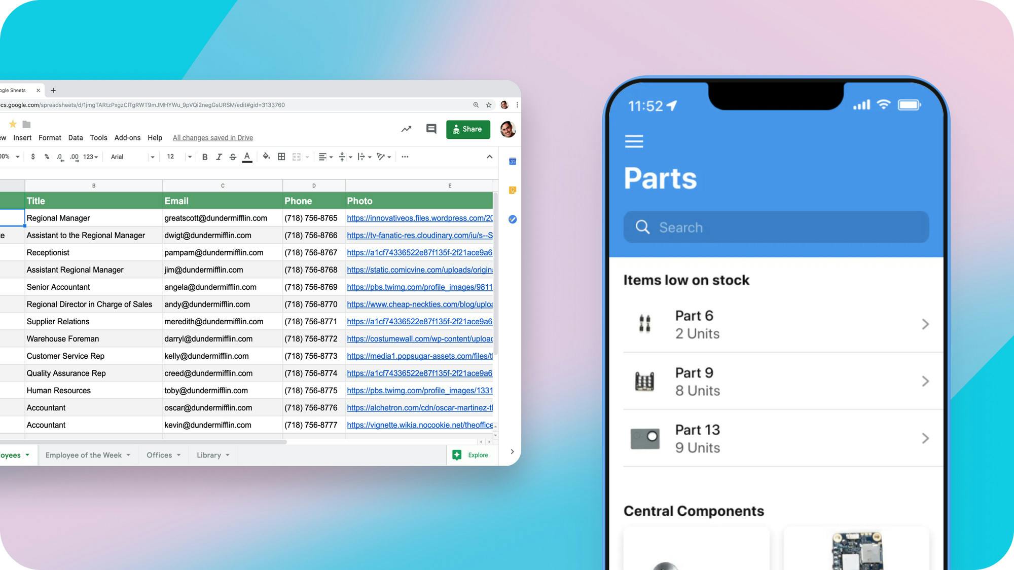
When you build apps with Glide, your design gets continually updated, ensuring that your apps always stay current.
We strive to allow for "just enough customization". This lets users not worry too much about design and preserves our ability to keep improving the foundation of your apps. Glide’s design team is constantly at work behind the scenes, working to give you and your users beautiful, modern apps.
Introducing Dark Mode
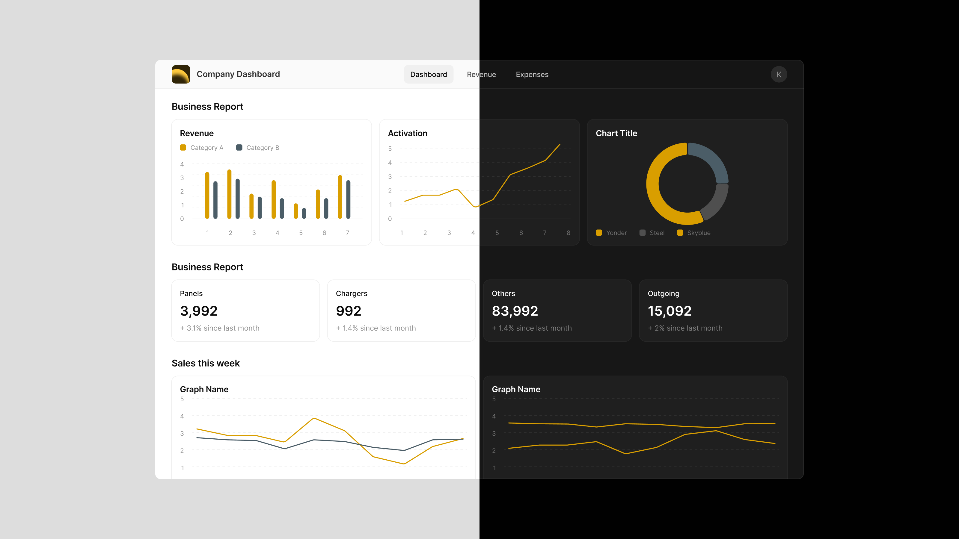
Our design system now supports Dark Mode, allowing you to build visually stunning apps with a dark, modern look and feel. Configuring Dark Mode in your apps is simple. Just open any app in Glide and go to "Settings > Appearance" to activate and adjust your Dark Mode design settings.
Dark Mode is automatically adaptive to the mode setting on your user’s device. This makes it unique in the landscape of no code design. Unlike other platforms, users don’t have to toggle any additional settings within your app. Your app is always tailored for the best experience of each individual, matching their device so it feels right at home.
When designing a Dark Mode app, all you have to do is turn on the feature. You don’t have to impose your preferences on all users or design two separate looks for your app. You also don’t have to know anything about interface design–contrast and color are automatically adjusted to preserve legibility.
Enhanced color contrast

We’ve updated our design system’s neutral color palette, ensuring improved contrast and readability for text and components. This further reinforces your accent color choice–central to making your users feel at home in your app–by making accompanying colors harmonize better.
Better dark accents
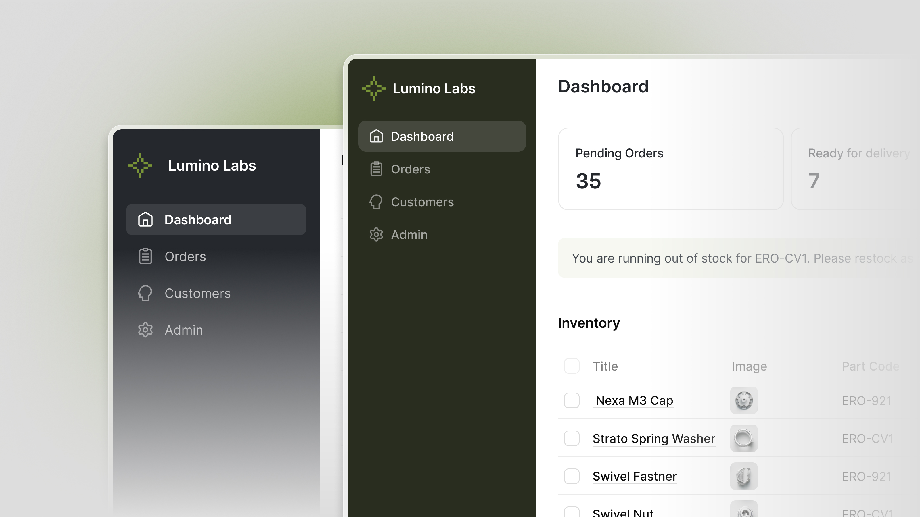
Dark navigation and containers now better complement your accent color.
Adaptive typography for mobile and desktop
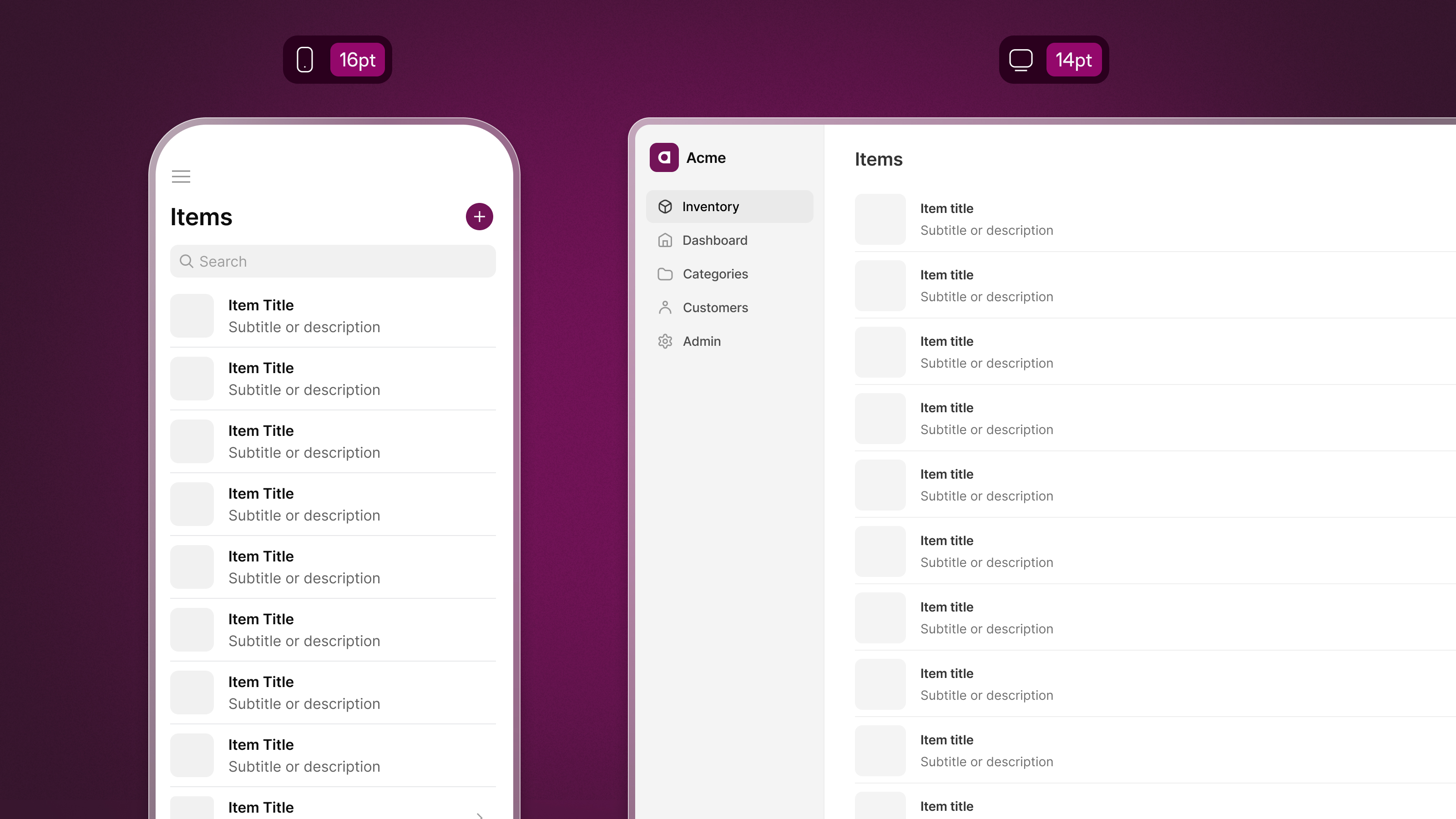
Our typography scale now adapts across mobile and desktop, enhancing text clarity and hierarchy. On desktop, the smaller crisp text will make screens feel denser, increasing the perception of productivity commonly associated with that medium. Conversely, mobile now gets slightly larger text to accommodate a mobile environment better.
Cohesive form components
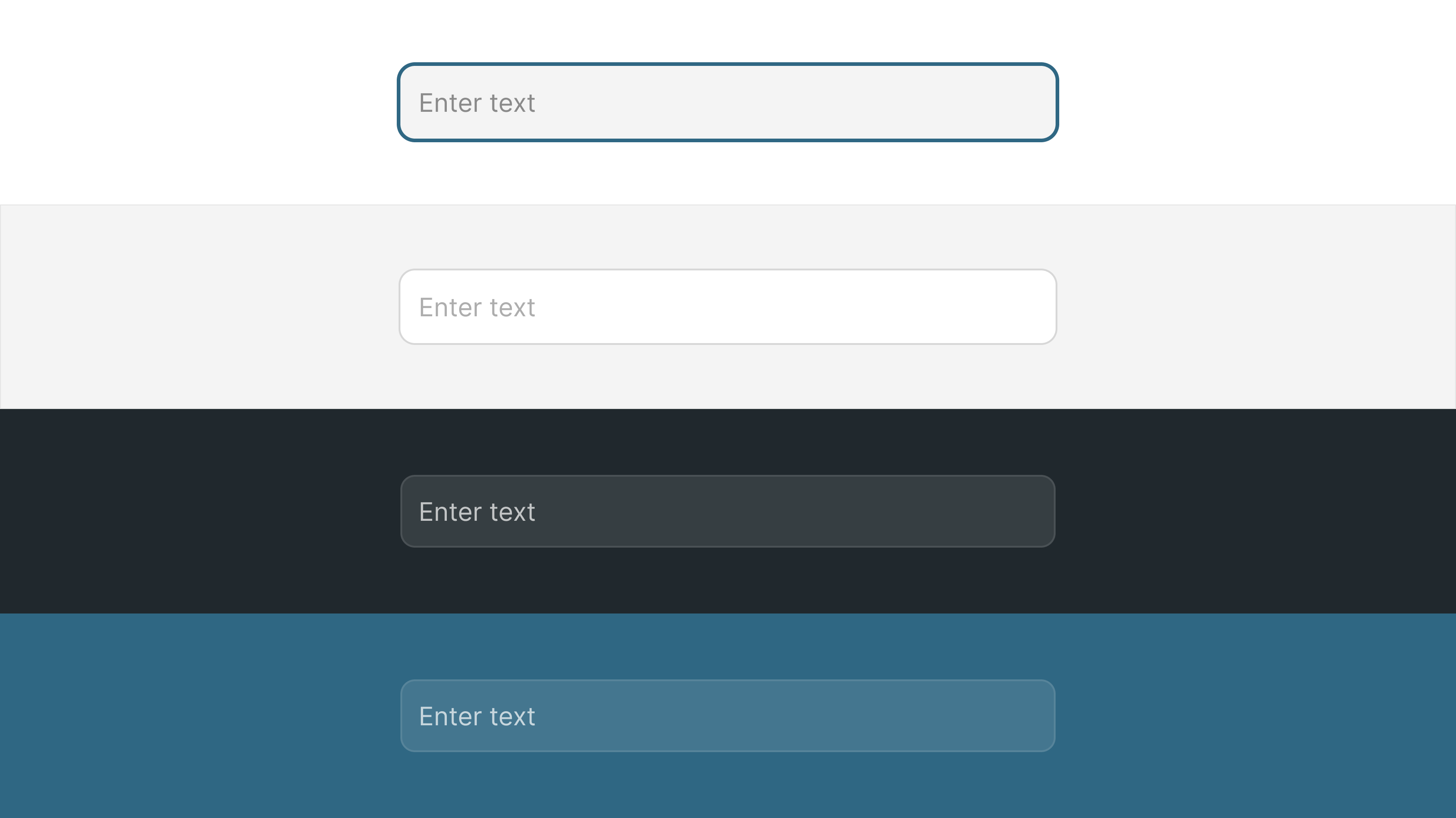
Form fields now match their section’s background color, providing a more cohesive experience when interacting with forms. This style also applies to Dark Mode form components.
Better software design means better software function
Each design update enhances the experience of using the apps you build. Apps that are intuitive, legible, and adapt fluidly to each device are more likely to be adopted by your team or customers.
Better software adoption means that your apps will have a bigger impact on your business, improving organization, communication, and productivity.