

What does a successful app look like?
One undeniable indicator of success is adoption rate—are people actually using your app? Adoption happens when users want to engage with an app because they can easily use it to perform their tasks. The user experience an app provides plays a large part in increasing adoption rates, and software rollouts often fail because an app is difficult to use.
“Design lets you provide the best possible user experience,” says Tristan L’Abbé, Head of Design at Glide. “It is the ideal shape of something in a way that’s functional and accessible to as many people as possible.”
When it comes to app design, “ideal shape of something” involves not only how the app looks but also how people use it—how they navigate between screens, how they process information, and what actions they take. There are two parts that go into these decisions: user experience design (UX) and user interface design (UI). Both directly affect functionality for the end user as much as an app’s technical elements.
We look at what they are, the role they play in creating an app, and how UX/UI design creates a good user experience.
What is UX/UI design?
UX design involves creating a product that is functional, accessible, and user-friendly. The process includes conducting user research to identify needs and pain points, mapping out the user journey, designing intuitive workflows, and organizing the app’s information architecture.
UI design involves creating a product interface that, like UX design, is functional, accessible, user-friendly, and also visually appealing. The process includes the design of navigation menus, layout and hierarchy of information and design elements on screens, selection of color schemes, and designing intuitive user experiences with the interface.
They have different processes but, according to Tristan, they aren’t ultimately that different at their core. “UX and UI design is just design,” says Tristan. “They just mean different steps in the same process of designing an end-user experience. They have the same goal, and they should be considered the same.”
The fundamental principles of UX/UI design apply for both, progressive web apps (PWAs), which can be accessed through a browser on any device, and native apps, which are built for a specific operating system, such as Android or iOS, and must be downloaded from its app store.
In this post, we’ll focus on designing PWAs, whether you’re coding an app from scratch or using a no code app builder.
Research and planning
People often equate UX design with wireframes, but that’s only one part of the process. “The research aspect of UX—collecting feedback, testing prototypes and going through this loop—can be extensive and specific,” says Tristan.
UX design means putting the user at the center of the design process with a focus on understanding user needs, behaviors, and pain points.
It’s also the first step of the design process that informs decisions on how to structure your app and present data. “Design comes in from the beginning when you take a step back [and look at] what you’re building,” says Certified Glide Expert Darren Alderman. “The tools you’re building are trying to solve a problem in the most streamlined way possible.”
1. Identify user needs and pain points
Before you even begin to design an app, you need to understand the business for which you’re building it, says Oscar Brooks, co-founder of V88 Agency. “Rule number one for us is to understand [the customer],” he says. “We want to know who they are and what they do in detail, even if it has nothing to do with the app that needs to be created, which might be 5 percent of their business. We need to understand all of their business.”
Once you’ve gained a thorough understanding of the business, you can turn to the app itself and learn about the context of how it’s going to be used. What are the app’s goals? How do you get users to achieve these goals?
Conduct user research to answer these questions. When building a business app, a good research approach is to talk to your users—both leaders or the team hiring you, so you can understand the end goals and business objectives, as well as the people who will actually be using the app daily so you can learn their current frustrations.
During these conversations, find out:
- What data is involved?
- Where does the data currently live?
- What do their current workflows look like?
- What problems are they facing with their current processes?
- What does their ideal state look like?
Your goal is to build an app that helps them get from their current state to this ideal state.
Be thorough with your research. The insights you gather in this initial research stage will inform many of the decisions you make as you design the app, from the planning stages all the way through to building the app.
2. Define information architecture
Information architecture refers to the planning and organization of an app’s content and functionality in a logical way, helping users understand where they are within the app and how to access various features or information they need. Information architecture includes your app’s sitemap, taxonomy or labeling, and navigation.
Here’s how to do this:
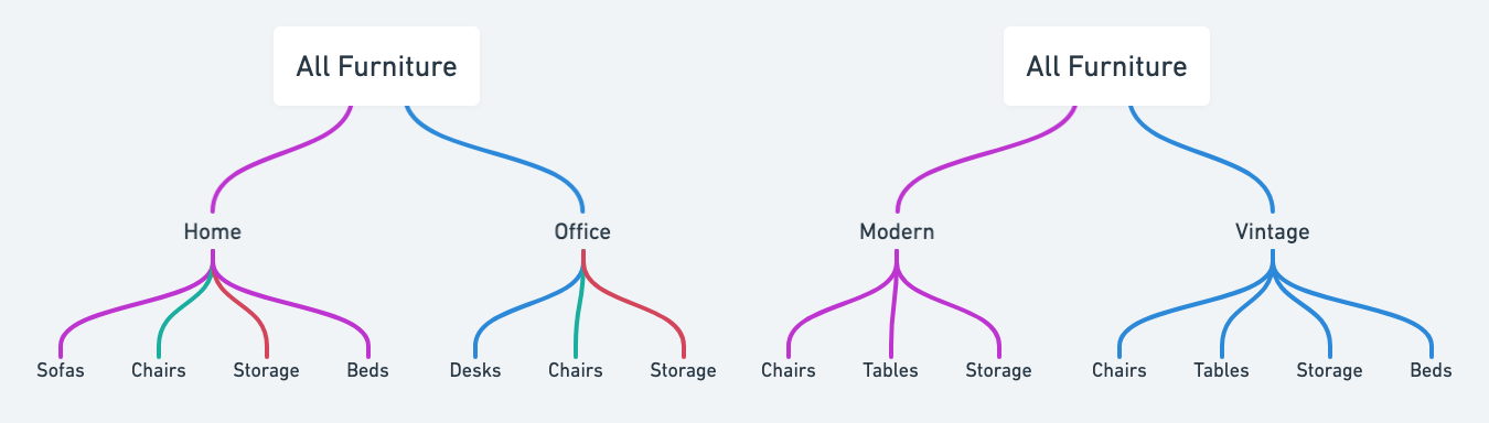
- Define data hierarchy: Examine how the data that will power your app is connected in terms of hierarchy. For example, if you’re creating an inventory management app for employees of a furniture store, you might have ‘All Furniture’ at the top. From there, you could break it down into categories like ‘Home’ and ‘Office.’ Each of these categories could then include specific furniture types, and then individual furniture items. Alongside this hierarchy, you could have another one based on different data points, such as ‘All Furniture’ at the top, followed by different collections, and then all furniture items within each collection.
- Determine navigation paths: How will users navigate from one part of the app to another? Create user flows and define the primary navigation paths, such as menus or tabs, and secondary paths, such as links within screens or breadcrumbs. These paths should align with the hierarchical structure you’ve established—the most important data or actions should be easy to get to from your primary navigation paths so users can easily perform important tasks.
- Create a sitemap: Draw out a sitemap that visually represents the structure of your app. It should include the primary screens accessible from the app’s menu, and the secondary screens users will navigate to from the primary screens. For your inventory app, you might have ‘Home’, ‘Office’, and ‘Collections’ as tabs in your main menu.
- Use easily identifiable language: Choose terminology that’s consistent with what the app’s users will be familiar with. This could depend on the specific language the business uses, common conventions in the industry, or even just universal terms for app users, such as ‘favorites’ or ‘bookmarks’ for items they want to save to return to later.
Your information architecture should be flexible enough to scale with the business and accommodate changes without requiring a complete overhaul. Use broad categories that can easily incorporate new subcategories or items as your business grows. For your inventory app, you may want to subcategorize home furniture into specific rooms later, to sit between ‘Home’ and the furniture types.
You could also consider adding tags to help identify specific aspects of data. For instance, along with ‘Home Furniture’ and ‘Office Furniture,’ you could include tags for ‘Suppliers’ or ‘Warehouse Location.’ This way, if you want employees to access furniture items based on this data later, it will be easy to implement.
Carefully defining your app’s information architecture creates a solid foundation for a good user experience and makes it easier to scale the app as the business grows.
3. Optional step: create a wireframe
If you were building an app using traditional development methods, the next stage would be to create a wireframe that visualizes the layout and functionality of the app’s screens to clarify design decisions before any coding begins. Without a wireframe, you might have to rewrite large portions of code to accommodate late design changes.
If you're designing directly in a no code app builder like Glide, you could skip this step altogether. Instead of spending time creating detailed wireframes of what the screens will look like, you can use the WYSIWYG capabilities of no code builders to design and edit in real-time as you create the app.
That said, there might be instances where you’d find a high-level wireframe can still be useful. For example, Darren uses wireframes to illustrate how different screens of an app connect with one another. “Sometimes, if I'm trying to explain things [to clients], I find it helpful to wireframe all the connections,” says Darren. “But I don't go into detail of what's going to be on those actual screens in the wireframe.”
If you decide to create a high-level wireframe, there are several design tools you can use, including pen and paper, Figma, Sketch, or Whimsical.
Visual elements of design
UI design focuses on striking a balance between decoration and usability to create a user interface that’s both aesthetically pleasing and functional. The key to achieving this? “Focus on one primary element per screen,” says Tristan. “If you want to include an image, just add one image. For actions, focus on one primary action.”
By concentrating on these primary elements, you can create a clean and effective design that guides users through the app without overwhelming them with too much information or too many options for interactions.
1. Consistency
Consistent UI design lets users intuitively interact with the app rather than needing to learn a new interface on every screen. This doesn't mean every screen must have an identical layout. Rather, the app should look and feel uniform across screens, so users always feel like they're interacting with the same app, no matter which screen they're on.
Let's look at some examples of what consistent UI looks like:
- Visual presentation: In your furniture inventory app, if you display a large image of a sofa above the text on the product screen, don't design your screens for chairs to include a thumbnail-sized image alongside the text. Maintain consistency in the visual design of screens that follow the same data formats.
- Interaction elements: If you use icons alongside button text on one screen, then all buttons across the app should have accompanying icons. Maintain consistency in how these interactive elements are presented on different screens.
- Feedback messages: If you use a red error message to indicate a form submission didn't go through, use the same color and language for other places where a user might encounter an error. Maintain consistency in how the app communicates information to users.
2. Establish content hierarchy
Now that you have the broader app architecture mapped out, it's time to plan the hierarchy of content on each screen. “Think about the purpose of the screen, and try to limit what’s on that screen to make it easier for people to find things,” says Darren. Including a lot of secondary information on a screen can make it hard for users to find what they need and confuses them about the app’s purpose. “If it takes me as long to find the information in [the app] as it did inside of the spreadsheet, well then it's not really a great design,” he says.
Reducing the number of components or elements on a screen has a bonus benefit: it makes your app faster, improving the overall user experience.
Some key questions to consider when establishing content hierarchy:
- What is the primary action you want users to take on this page?
- What information do they need to complete this action?
- In what order should this information be presented, from most to least important?
- How will this content adapt across different devices?
To create a clear content hierarchy, Darren recommends structuring content from top to bottom in order of importance to match the flow of how users engage with the screen. “Use headings to visually break up information so it’s easier to scan through,” he says.

Learn about the principles of adaptive design.
Read the guideRemember to plan your content for adaptive design. For PWAs—which can be accessed on desktop, laptop, tablet, and phone screens—designing your app to adapt to different device sizes lets users see the information in the correct order of importance no matter what device they’re using.
For example, on a web app, you may display some information in columns. But on a mobile app, that same content should stack vertically for easier scrolling since the screen width is smaller.
Some no code app builders like Glide automatically adapt to different screen sizes, so you don’t have to worry about designing separate screens for each device.
3. Follow the brand style guide
The business you’re designing for—whether that’s your own or a client’s—may have a brand style guide. This document outlines the brand’s color palette, typography, logo usage guidelines, and, in some cases, language and naming conventions.
Following the brand style guide helps maintain consistency across all the business’s platforms. When users interact with the app, they should feel like they’re engaging with the same brand they know from its website, social media accounts, and email newsletters. This consistency improves the user experience as they’ll be familiar with the visual and linguistic elements that reflect the business’s identity.
Accessibility
With 1 in 6 people worldwide living with a disability, and many hidden disabilities such as eyesight impairment and dyslexia that may not be immediately apparent, app design needs to consider accessibility to cater to different user needs.
This is especially important when you consider that 88% of employees with hidden disabilities choose not to disclose them in the workplace to avoid discrimination.
Designing for accessibility benefits all users, regardless of their disability or comfort level with technology. It accommodates users in different contexts, such as those in brightly lit environments who may struggle to see the content clearly or those under time constraints who need to complete tasks efficiently.
Here are some things to consider to design an accessible app:
- Contrast: The contrast between the background colors in your app and the text color should be high enough for people to read the text clearly. Tools like Accessible Web’s Color Contrast Checker and Accessibility Checker can help you see if your contrast meets the Web Content Accessibility Guidelines recommended standards.
- App customization: While using a no code app builder may limit customization features, explore the options available to you. Something as simple as toggling between light and dark modes can improve readability for some users.
- Button text: Use clear, descriptive text on buttons that makes it apparent what action the user will take. Avoid using icons alone, as the button’s purpose may not be immediately obvious without the accompanying text.
- Form fields: Make sure there are visible labels written in user-friendly language for all form fields. Providing descriptive labels makes it immediately clear what information should go into the field.
- Scannability: Present content in a way that's easy to scan by using headings, bullet points, and short paragraphs. This benefits users with cognitive disabilities and those who are quickly looking for specific information.
Test and iterate
The research phase doesn’t end when the app is published. To improve your app, you need to test and refine it to make sure it remains effective and easy to use.
One of the best ways to improve your app is to talk to your users directly. Ask them about their experiences using the app—what parts of it they’re struggling with, and what parts help them achieve what they’re trying to do.
Conduct usability tests with users to observe how they interact with your app in real-world scenarios. Pay attention to where they encounter difficulties, get confused, or abandon tasks. For PWAs, there are a few ways to do this:
- Mobile testing: Assign testers some specific tasks, and ask them to record the screen as they complete these tasks. You should be able to see how they navigate the app from the recording.
- Web app testing: Give the tester specific tasks to perform while sharing their screen on a video call. Ask them to think out loud as they use the app so you can understand why they took a certain action or what confused them.
Iterate on your app based on user feedback and testing results. When it comes to making changes, don't be afraid to remove features or simplify the app if it enhances the user experience. Then, test again to validate that your changes worked.
Master app design with Glide
Designing an app involves several steps that start and end with the user. Every decision you make should put the user at the front: what role will this component or information play in helping the user complete their tasks effectively?
If you use a no code app builder, you may face some constraints based on the platform you choose. According to Tristan, that’s an opportunity to think outside the box to solve the problem. “True innovation comes through combining the principles of design and the technical constraints of the platform you’re building for,” says Tristan. “They are a vehicle for your vision.”
Glide simplifies the design process with pre-configured components that are already optimized for usability. Combine this with an understanding of design principles, and you can enhance your skills as a Glide developer, creating apps that are both visually appealing and intuitive for users.
If you’re looking for resources on how to design an app in Glide, start by exploring Glide’s template library to see the fundamental design principles in action. You can also join the Glide community to connect with and learn from other Glide developers on your journey to becoming a Glide Expert.
Design your Glide app today
Sign up
Shivani Shah is a writer, editor, and content marketing consultant who likes to make complex ideas easy to understand. She believes in "show, not tell" and works with B2B tech companies, helping them highlight how their products can solve customer problems. Her areas of expertise include community management and data privacy.


