Hey Gliders!
Our top priority at Glide is to make your software development journey as seamless as possible. So, we're excited to share our latest product updates, which include several new button customizations that offer greater design flexibility when building your apps. Our team of designers worked hard to craft these button customizations with your needs in mind, ensuring that they look great and make your apps more functional and user-friendly.
We can't wait for you to try these out, so let's dive in.
Icons for buttons
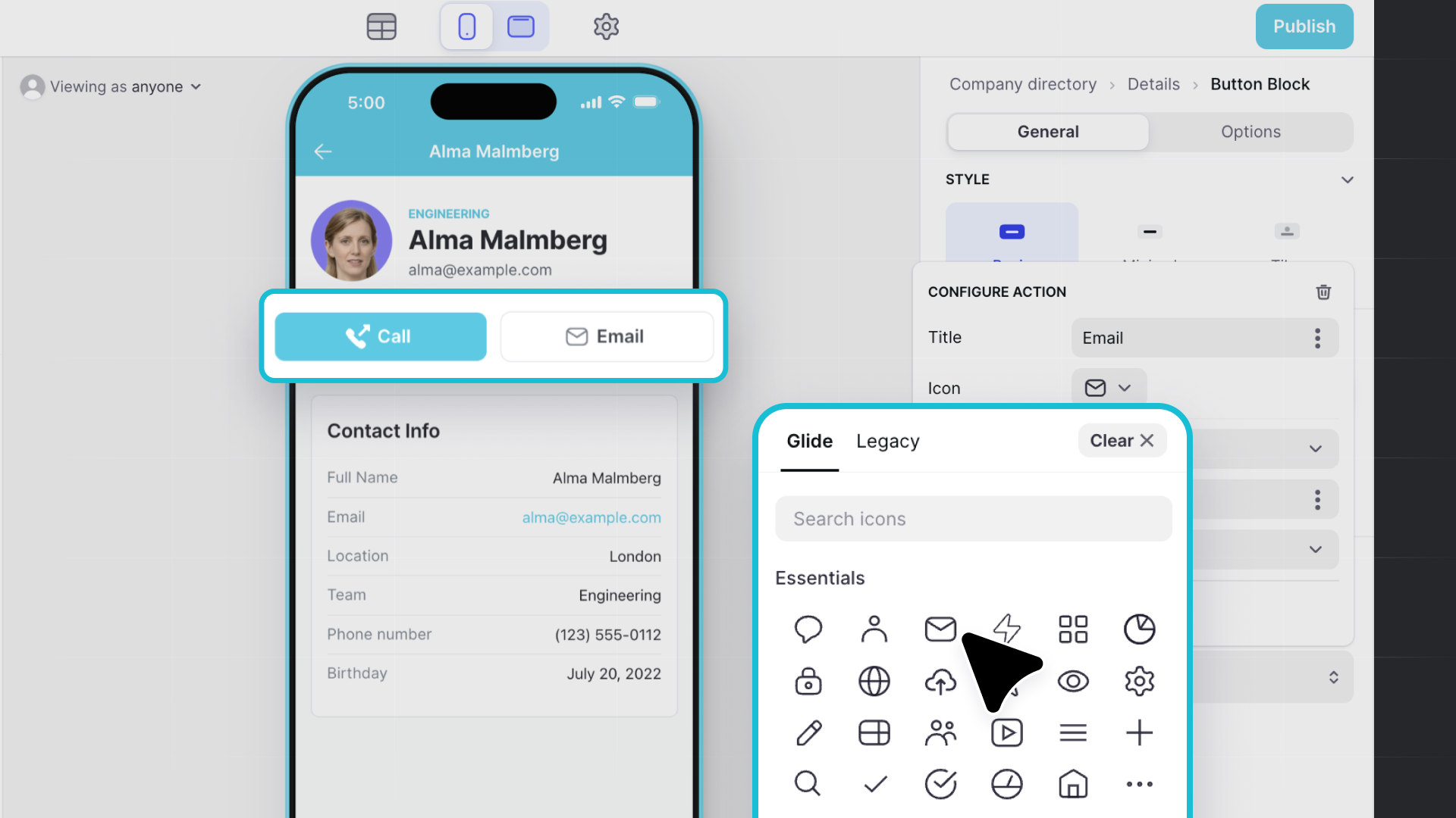
This update introduces the ability to add icons to buttons within apps and a refreshed collection of icons for a more sleek, modern look. Users can still choose to use the legacy icons if they prefer. This update enhances the functionality and aesthetic appeal of your apps. It ensures they always remain contemporary in the ever-evolving world of software.
New button styles: Basic, Minimal, and Tiles
We've expanded our button styles to provide more UI design options. With Basic, Minimal, and Tiles to choose from, users can select the level of emphasis they want to place on their buttons within their app.
Custom Button Options
Width
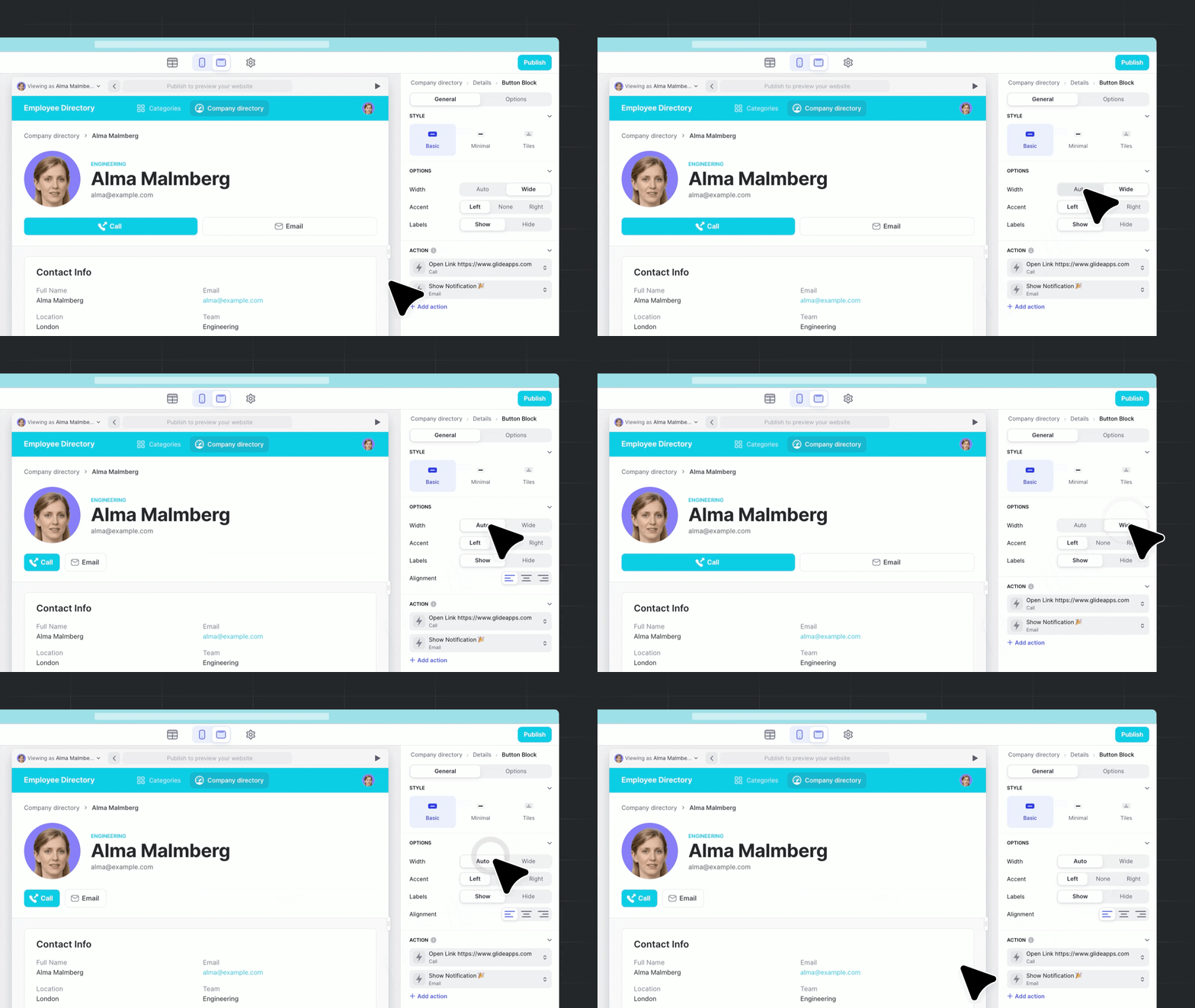
We've introduced new button width options to give users more control over the layout of their app. You can now choose between Wide, for full-screen width buttons, or Auto, which automatically adjusts the width based on the button size.
Accent
We've empowered you with greater design control over the accent color of your buttons. With the option to enable or disable the accent color of a button, you can now choose whether to apply this feature widely or selectively for specific custom blocks.
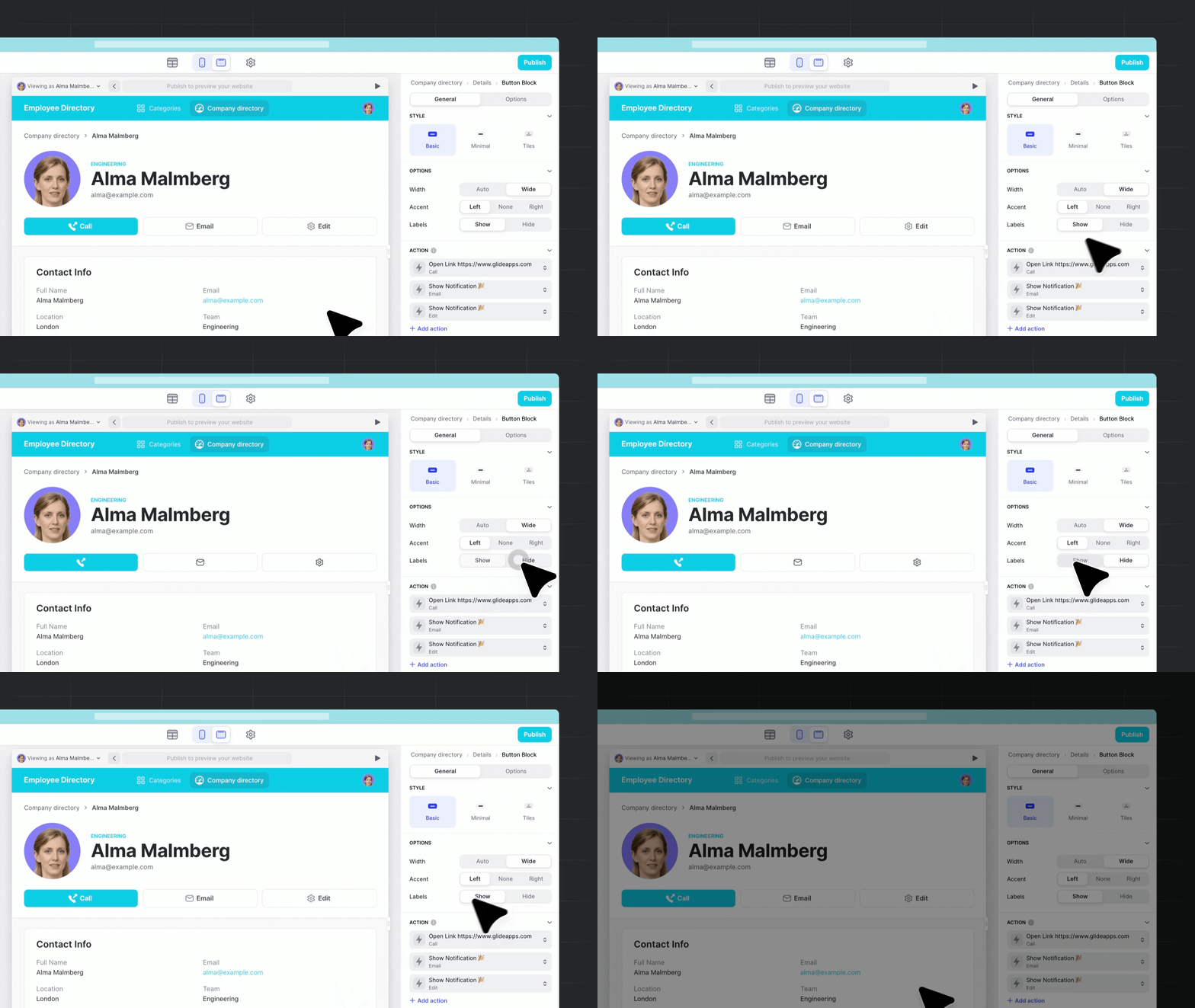
Labels
We've given you the flexibility to customize the display of button labels in your apps. With the ability to turn them on or off, you can now choose to show only the button icon or both the icon and label for a more intuitive user experience.
Bonus: Mini buttons
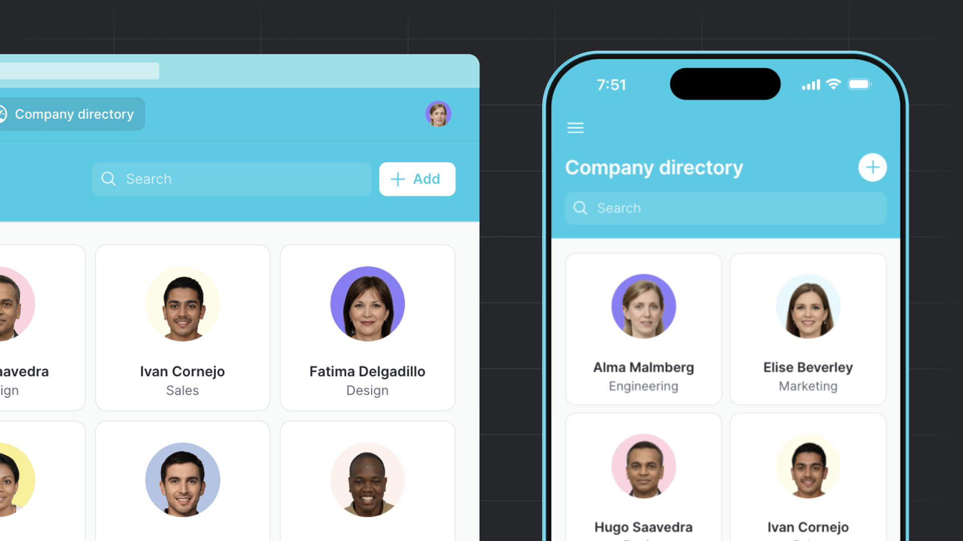
We understand the importance of ensuring that apps look great on every device, so we've added a mini version of buttons in the mobile version of your apps. Additionally, we've added a fun Easter egg for users who choose to use the '+' icon for an Add action, which will show just the icon in the mobile version, providing a clean and streamlined design.
