Style your title component in new ways
This month, we have expanded our design options for your Glide Apps with four different styles for the title component. With these new styles, you can give your apps a more personalized and branded look and feel. Let’s dive in.
Simple Style
This is our classic title style and quick way to visualize your data clearly. The title and image both have the same visual weight.
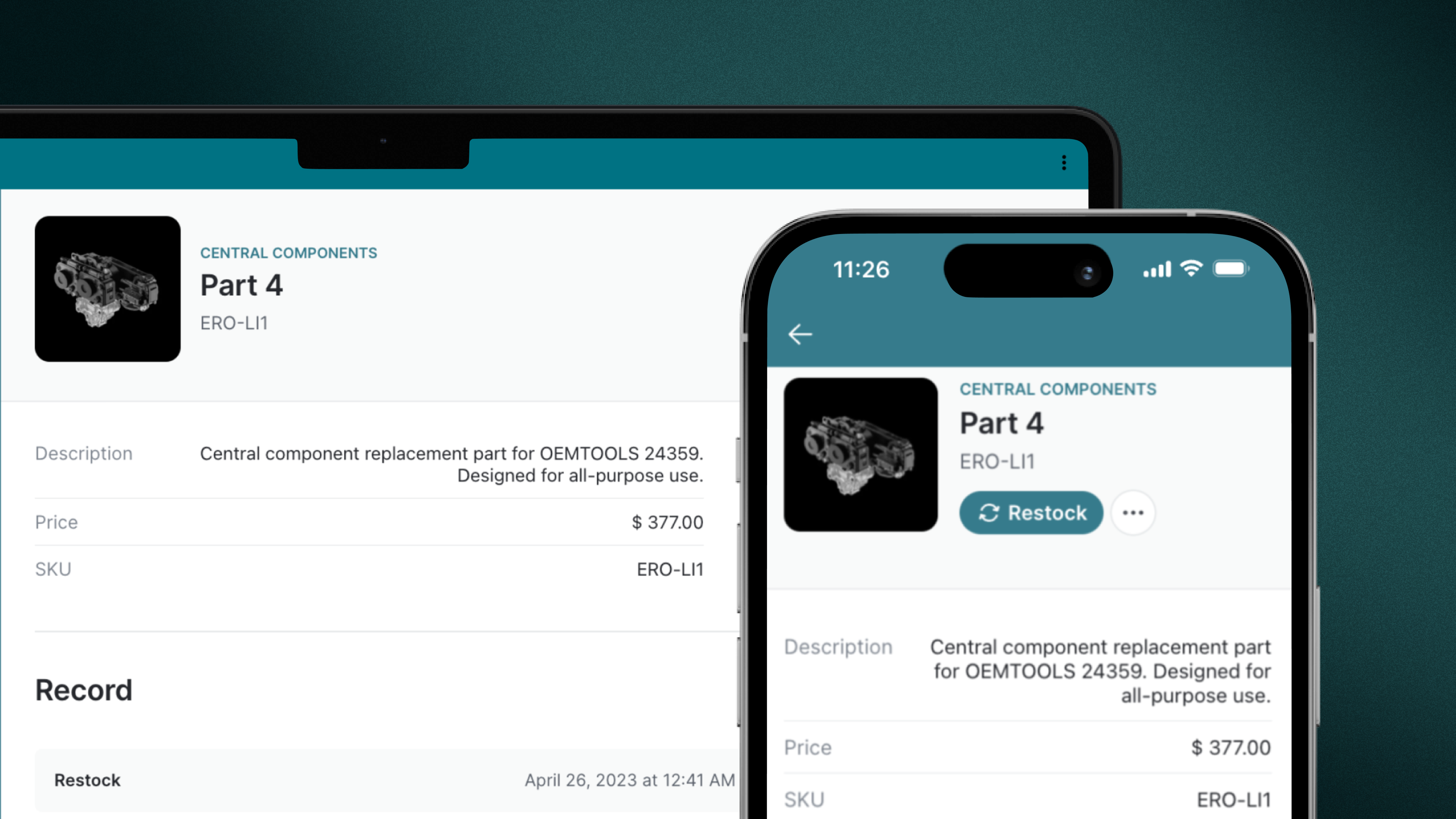
Image Style
The new image style is ideal for displaying images with greater detail and showcasing them more prominently alongside your title. It's a great choice if you're building an inventory app and want to highlight each product's features.
Cover Style
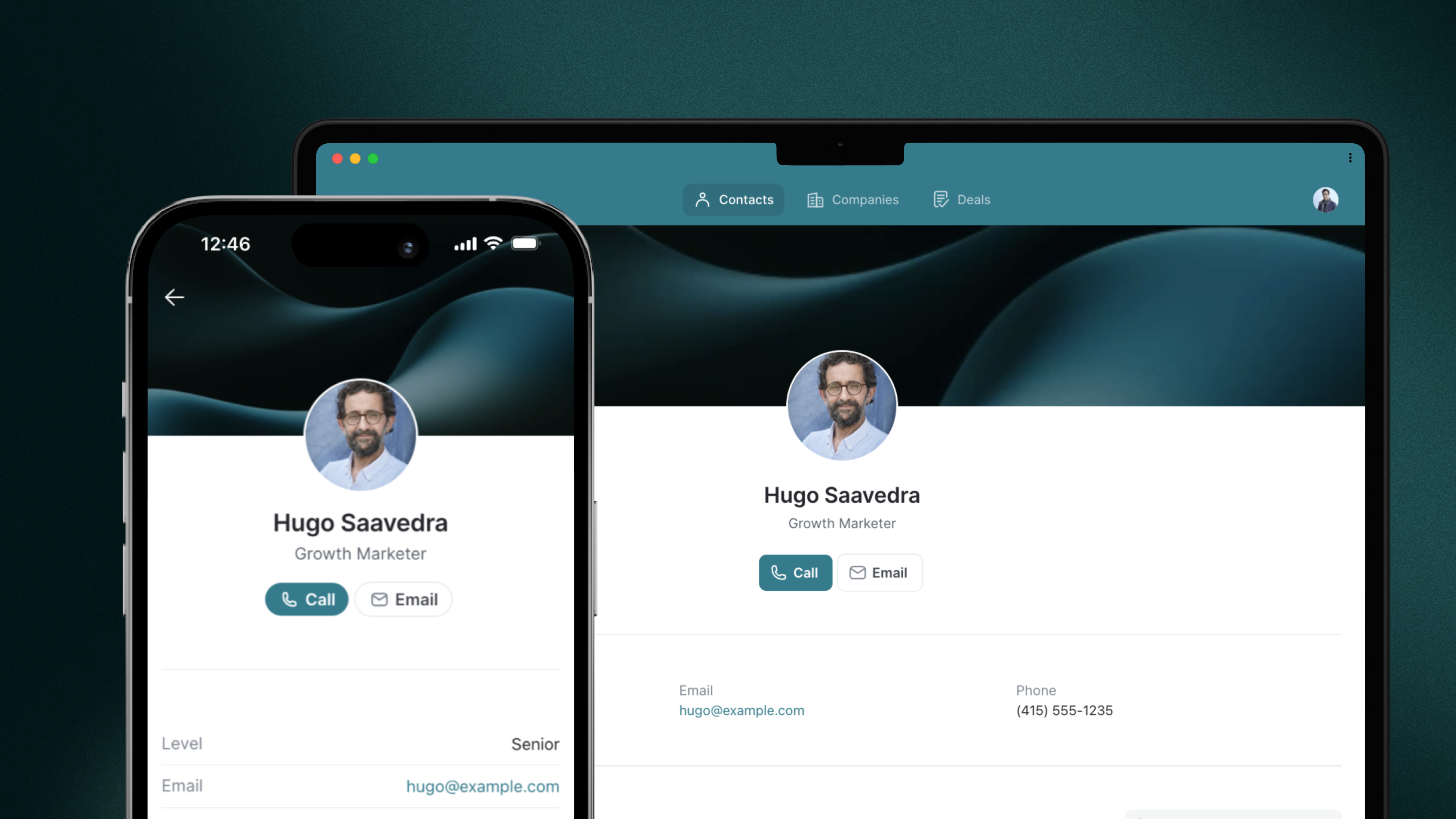
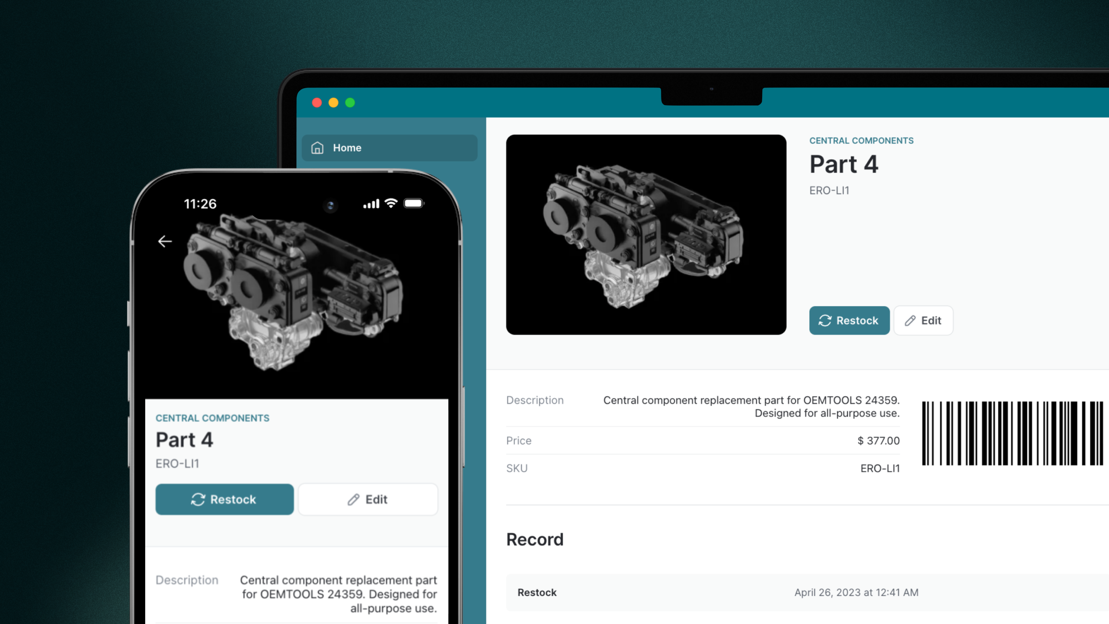
The new Cover style gives your apps a more unique look and feel. Similar to other platforms, this style allows you to add covers to your titles, making them feel more personal and modern.
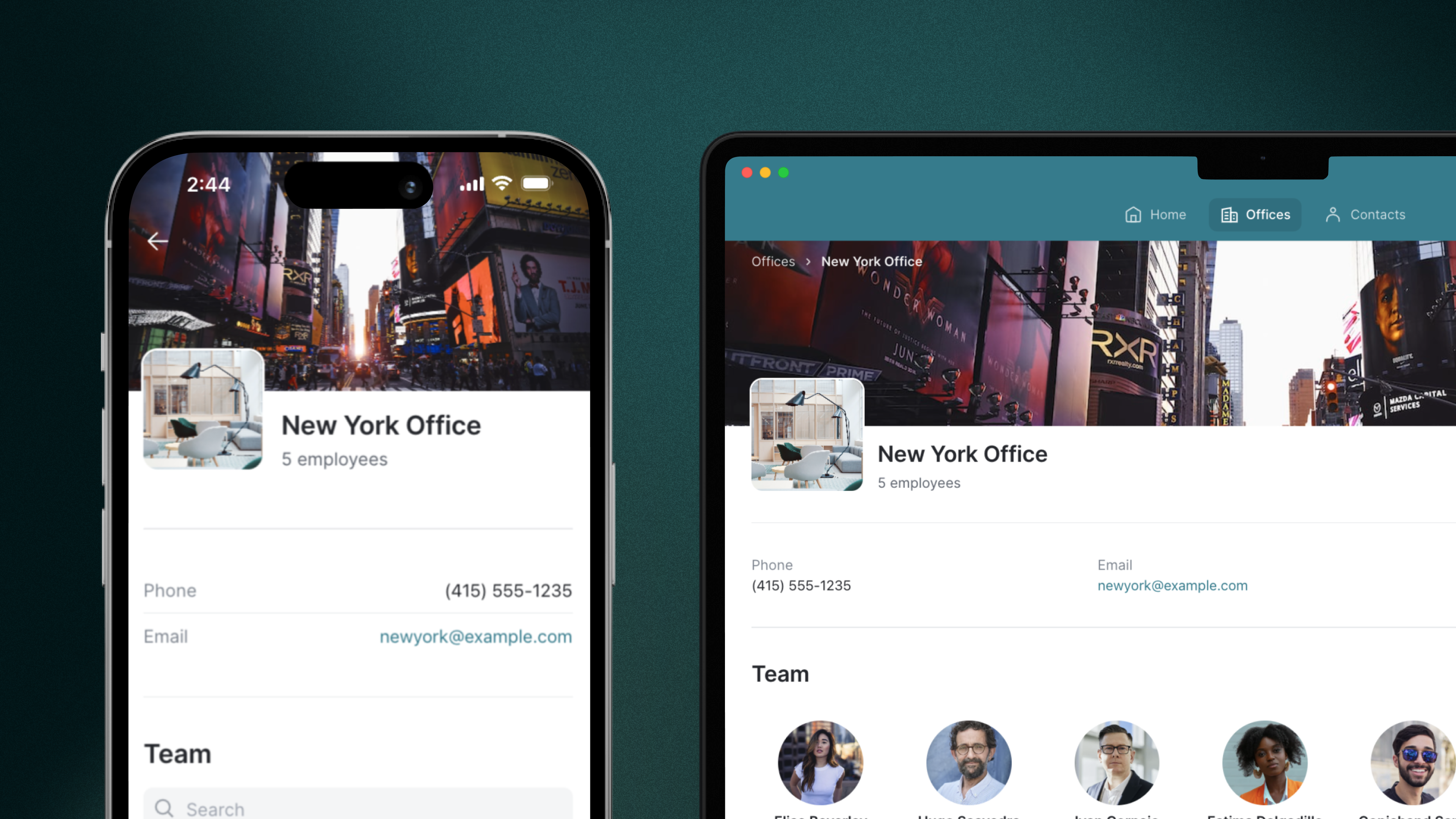
Profile Style
The Profile style is very similar to the Cover style, showcasing the title, profile image, and cover. However, with the Profile style, the title and image are centrally placed, making it an ideal choice for designing user profiles within your apps. It is also great for highlighting actions to take about a user since those remain centered.
