

Tabs Container
This feature is in beta. Features in beta can be unpredictable and may change as development continues. The Glide Support team does not provide help with these features. Please post any questions in the Community forum.
The Tabs Container component is similar to the Container component: it acts as a parent inside which you can add child components. The components you add will be separated into different tabs, allowing users to click between the tabs to view each component in the interface.
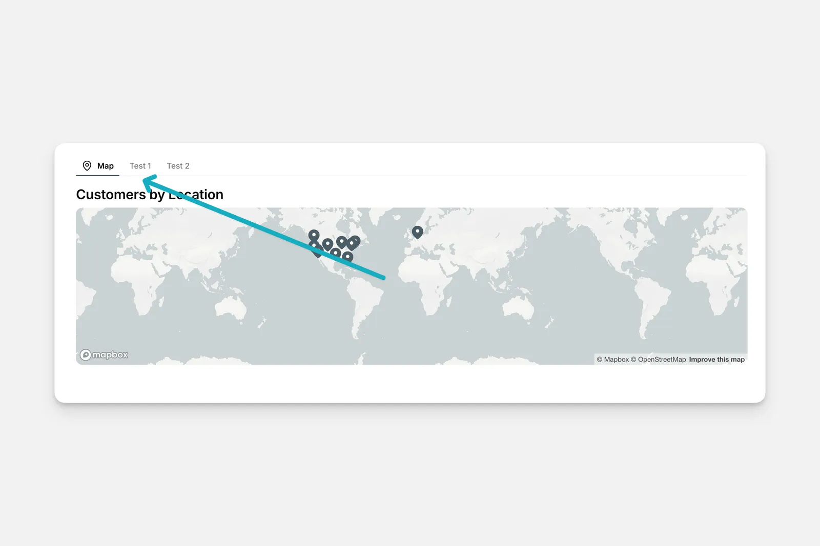
Setting up the Tabs Container Component
In the Layout Editor, select the screen you want to edit.
You will see a blank container with a + symbol. Selecting the plus will open the component menu, where you can choose a component to add to the container. You can also add more components to the container by clicking on the + insert component button on the left, in the components list.
A separator will appear in the tabs container component to differentiate between each tab. Components can be dragged and dropped between different tabs.
Customizing the Tabs Container Component
When you add components to the Tabs Container, each component within the container will have its own configuration options. To customize each component, click on it to open the configuration menu on the right.
The Tabs Container itself also has customization options that change the design and visibility of the whole container. To customize the Tab Container component itself:
Choose Line or Button style. This will either underline the Tab name in the interface or put a shaded box around it.
Visibility conditions can be set per tab, as well as for the whole tab container component. Custom CSS and Builder notes can be added under the Options menu.